How Colour Choices Influence Customer Satisfaction in Hospitality

Colour Choices
Colour is a powerful tool in shaping customer experiences in the hospitality industry. From restaurants to hotels, the colours used in interiors and exteriors can influence how guests feel and interact within those environments. This subtle yet impactful factor can significantly boost customer satisfaction, ultimately affecting how they perceive and enjoy their stay. Choosing the right colours involves more than just aesthetics. It's about understanding the psychology behind different hues and how they align with the desired ambiance. For instance, warm colours like reds and oranges can create a lively and social atmosphere, perfect for bustling restaurants. In contrast, cool tones like blues and greens are calming and relaxed, ideal for creating soothing hotel environments. Strategic application of colour can transform spaces, making them more appealing and memorable to guests. By carefully coordinating colours with brand identity and desired customer emotions, hospitality businesses can create inviting settings that enhance guest experiences. This thoughtful approach not only enriches first impressions but also fosters lasting connections with the brand, encouraging repeat visits and positive reviews.

The Psychology Behind Colour in Hospitality

Colours influence emotions and behaviours, playing a crucial role in the hospitality sector. Understanding the psychological effects of colours can help create environments that appeal to customers on a deeper level, enhancing their overall experience. 1. Warm Colours: Shades like red, orange, and yellow create a lively and energetic ambiance. These colours can stimulate appetite and conversation, making them popular choices in restaurants and dining areas. However, too much of these shades can become overwhelming, so balance is key. 2. Cool Colours: Blues, greens, and purples have a calming effect. They are perfect for spaces meant for relaxation and unwinding, such as hotel rooms or spa areas. These colours can help reduce stress and encourage tranquility. 3. Neutral Colours: Whites, greys, and beiges serve as great backdrops, providing a clean and elegant look. They promote a sense of balance and can make a space feel open and inviting. 4. Bold Accent Colours: Using bold colours as accents can highlight specific areas and draw attention. They add personality and vibrancy without overpowering the entire space. By strategically choosing and combining these colours, hospitality businesses can evoke desired emotions in their customers, enhancing their satisfaction and overall experience.

Strategic Colour Placement in Hospitality Spaces

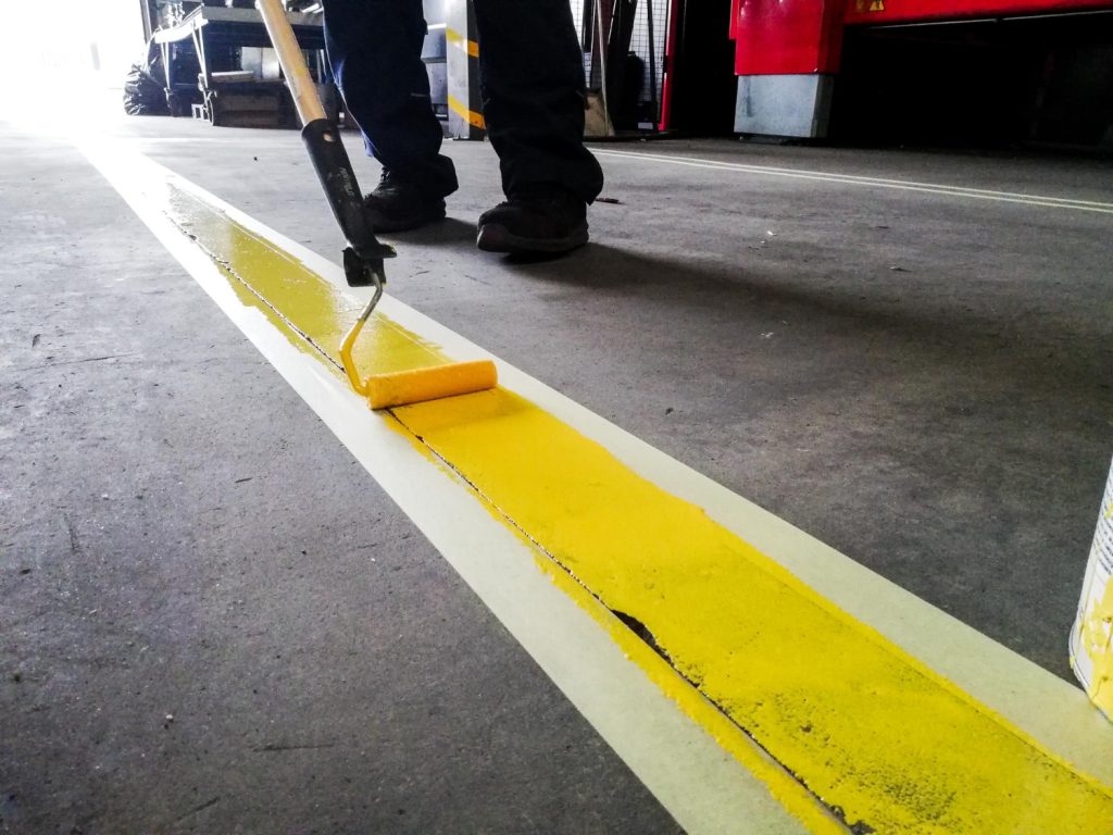
Choosing the right colours is only the first step. Their placement within hospitality spaces significantly influences their effectiveness. Understanding where and how to apply these colours can make a substantial difference. 1. Entrance and Reception Areas: These areas set the first impression. Warm and welcoming colours can greet guests with a friendly atmosphere, encouraging them to feel at ease right from the start. 2. Dining Spaces: Incorporate colours that enhance the dining experience. Use warm hues to stimulate appetite and conversation, creating a lively environment. Consider contrasting accents to define service areas clearly. 3. Guest Rooms: Comfort is key here. Opt for soothing cool colours to promote relaxation and restful sleep. Adding occasional warm accents can provide a touch of warmth without losing calmness. 4. Communal Areas: Meeting rooms and lounges should have a balanced palette. Use neutral tones for versatility, peppered with strategic pops of colour to maintain interest and energy. 5. Outdoor Areas: Consider exterior paint and line marking to define pathways and spaces clearly. Vibrant colours can make outdoor areas more inviting, helping guests navigate with ease. Placing colours strategically not only enhances aesthetics but also functions to improve customer satisfaction by ensuring spaces feel cohesive and well thought out.

Enhancing Ambiance through Colour Schemes

Crafting the right ambiance in hospitality spaces involves a thoughtful mix of colours that reflect your brand's identity and cater to the desired guest experience. Creating an engaging atmosphere involves more than just the base colours; it’s about how these colours interact and complement each other. 1. Complementary Schemes: These involve using colours opposite each other on the colour wheel. In high-energy zones like gyms or event halls, these can create dynamic and exciting environments with a sense of balance. 2. Analogous Schemes: These consist of colours next to each other on the colour wheel, offering a more harmonious and serene feel. Perfect for spas or relaxation areas, these schemes help create a seamless transition between zones of similar activity. 3. Monochromatic Schemes: Using different shades of the same colour provides a clean and cohesive look. Ideal for brands aiming for minimalism, this scheme allows different textures and materials to play a starring role. 4. Accent Colours: Introducing pops of bold colours in small doses through furniture or decorative items can breathe life into a predominantly neutral room, keeping it vibrant and engaging without overpowering. Dynamic colour schemes that enhance ambiance encourage guests to linger and feel more engaged with their surroundings, greatly contributing to their overall satisfaction.

Maintaining Colour Consistency for Customer Satisfaction

Consistency in colour not only supports a cohesive brand image but also fosters a sense of reliability and professionalism. Hospitality businesses that maintain consistent colours across all areas facilitate better customer experiences, ensuring spaces feel unified and thoughtfully designed.

Regular Maintenance and Touch-Ups:

Routine maintenance programs are essential to keep colours fresh and vibrant. Regular touch-ups prevent fading and wear, maintaining the intended mood and aesthetics of each space.

Protective Coatings:

Employing protective coatings can help guard against everyday wear and tear. These coatings protect high-use areas like hallways and lobbies, ensuring durability and longevity while reducing the need for frequent repainting.

Graffiti Removal:

For businesses exposed to vandalism, quick graffiti removal helps preserve the integrity of the original design. Ensuring walls are free of graffiti retains the overall appearance and enhances customer perception.

Periodic Reviews:

Assess the alignment of colour schemes with your brand’s evolving identity and guest expectations. Adapting colours to current trends or feedback helps maintain relevance and keeps the environment inviting. Maintaining colour consistency ensures hospitality spaces continue to provide satisfaction, reaffirming the establishment as a dependable and stylish option for guests.

Conclusion

Understanding colour choices and their strategic application is integral for enhancing customer satisfaction in hospitality. By employing psychology, careful placement, and maintaining consistency, businesses can create inviting spaces that resonate with guests. Thoughtful colour choices enhance ambiance and support a cohesive brand identity, ensuring guests not only enjoy their visits but are eager to return. Transform your hospitality venue with expert commercial painting solutions from Nu-Vision Painting. From protective coatings to vibrantly coloured spaces, our team ensures your environment remains appealing and consistent, promoting a memorable guest experience. Let us help you make your venue stand out with colours that captivate and engage.
Tags :
Professional Painting Services

Leave a Reply

Your email address will not be published. Required fields are marked *