REQUEST A QUOTE
yellow office painting

Create a Better Workplace with These Office Painting Ideas

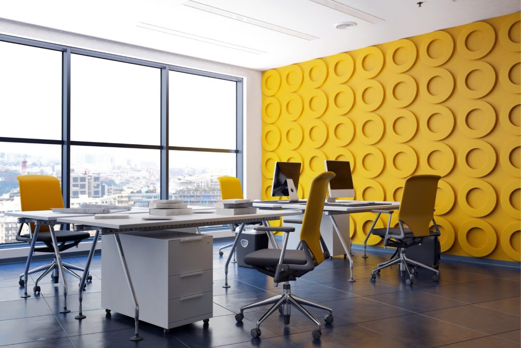
The color of your walls can impact your work environment, productivity, and even your mood. Choosing the right color for your office space can be challenging, especially if you want to create a professional atmosphere. A professional office space requires a color that is both calming and productive. Here are some painting ideas worth considering:

Neutral Colors

Neutral colors are a timeless classic that can create a professional and calming atmosphere. Neutral colors such as beige, gray, and white are perfect for office spaces because they are easy on the eyes and help to reduce stress levels. These colors also provide a clean and polished look, which is perfect for a professional environment.

White is a popular color choice for offices because it is associated with cleanliness and purity. It also creates a spacious and airy feel, benefiting small office spaces. In addition, the colors beige and gray provide a calming and neutral backdrop to your workspace.

Blue

When it comes to adding a pop of color to your office, blue is a popular option. It is known to have a calming effect on the mind and can help to increase productivity. Blue also symbolizes trust and loyalty, making it an excellent choice for businesses that value these traits. Light blues can create a relaxing atmosphere, while darker blues can add a sense of professionalism and authority.

Green

The color green is associated with nature and growth, making it a great choice for companies that prioritize sustainability and environmentalism. It can also represent wealth and money, making it a good choice for financial businesses. This can calm the mind and promote a sense of balance and harmony in the workplace.

Yellow

If you want to grab someone’s attention, yellow is the way to go. This bright, bold color is often associated with energy, optimism, and creativity. It’s also commonly used by companies in the food industry as it can stimulate appetite and promote optimism. However, too much yellow can be overwhelming and may even cause anxiety, so use it in moderation.

Red

There is a reason why red is often used in warning signs and signals why red is also associated with passion, love, and excitement, making it a popular choice in the entertainment and fashion industries. However, too much red can cause stress and anxiety, so balance it with other colors.

Orange 

The warmth and energy of orange make it popular for promoting creativity and enthusiasm. It is also often associated with excitement and adventure, making it a great choice for travel and outdoor brands. However, like red, too much orange can be overwhelming, so pair it with other colors for balance.

Purple

Luxury, loyalty, and prestige are often associated with the color purple. It can also be seen as a symbol of creativity and spirituality. High-end brands often use purple to create a sense of sophistication and elegance. It can also promote products or services associated with relaxation and wellness, such as spas or yoga studios. 

Final Thoughts

Colors can have a significant impact on our emotions and behavior. By understanding the psychology behind different colors, you can use them effectively in your marketing and branding efforts. Use colors in moderation and balance them out with other colors to create a visually appealing and emotionally engaging experience for your audience.

At Nu-Vision Painting, we understand the importance of color in creating a desired atmosphere and mood. Our professional painters in Perth can help you choose the right colors for your commercial or residential property and ensure that the final result meets your Aexpectations. Request a quote today to start transforming your space!